Digital Map Gallery
2026 Submissions
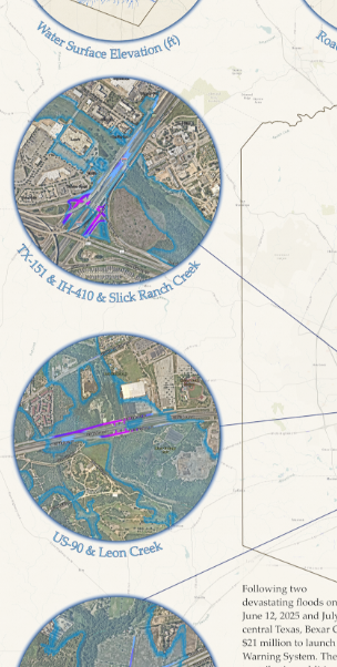
Roads Flooding During a 10% Annual Chance Storm in Bexar County, Texas
1a
Trinity Shuler NEED LINK
Roads Flooding During a 10% Annual Chance Storm in Bexar County, Texas
1a
Trinity Shuler NEED LINK
Description:
This static map depicts the results of an analysis predicting where flooding will occur during a 10% annual chance storm in Bexar County, Texas. The inputs of the analysis include water surface elevations produced by the San Antonio River Authority during FEMA floodplain mapping updates, and road surface elevations produced by researchers from the University of Texas at Austin and the Oak Ridge National Laboratory who derived a Digital Surface Model from Lidar hosted by the TxGIO DataHub.
Purpose:
This map is intended to aid in identification of roads in need of a high water detection system, as part of the San Antonio River Authority's Next Generation Flood Warning Program.
Austin Sanborn Atlas
2s
Jennifer Chenoweth
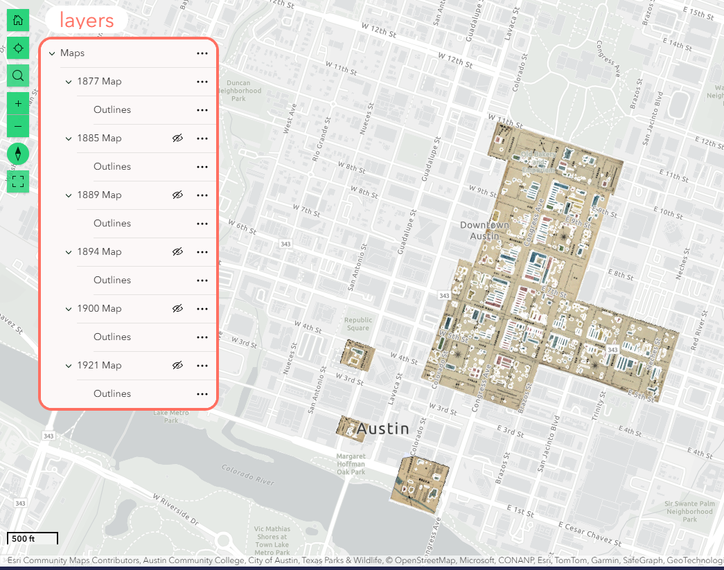
Austin Sanborn Atlas
2s
Jennifer Chenoweth
Description:
Application that accesses georeference Sanborn Maps through 1921 in Austin, Texas, created by Clio.GIS for the Austin History Center
Purpose:
This digital map product allows historians and researchers to access historic property maps and data from Sanborn Fire Insurance Maps 1877-1921. These are viewable as layers and transparencies over either a base road map or satellite imagery. Attribute tables were created for each building. The work was completed by Esri for the Austin historic digital twin project, Re-creating Early Austin.
Fishing Around: Aransas
3s
Paul Daugherty NEED LINK
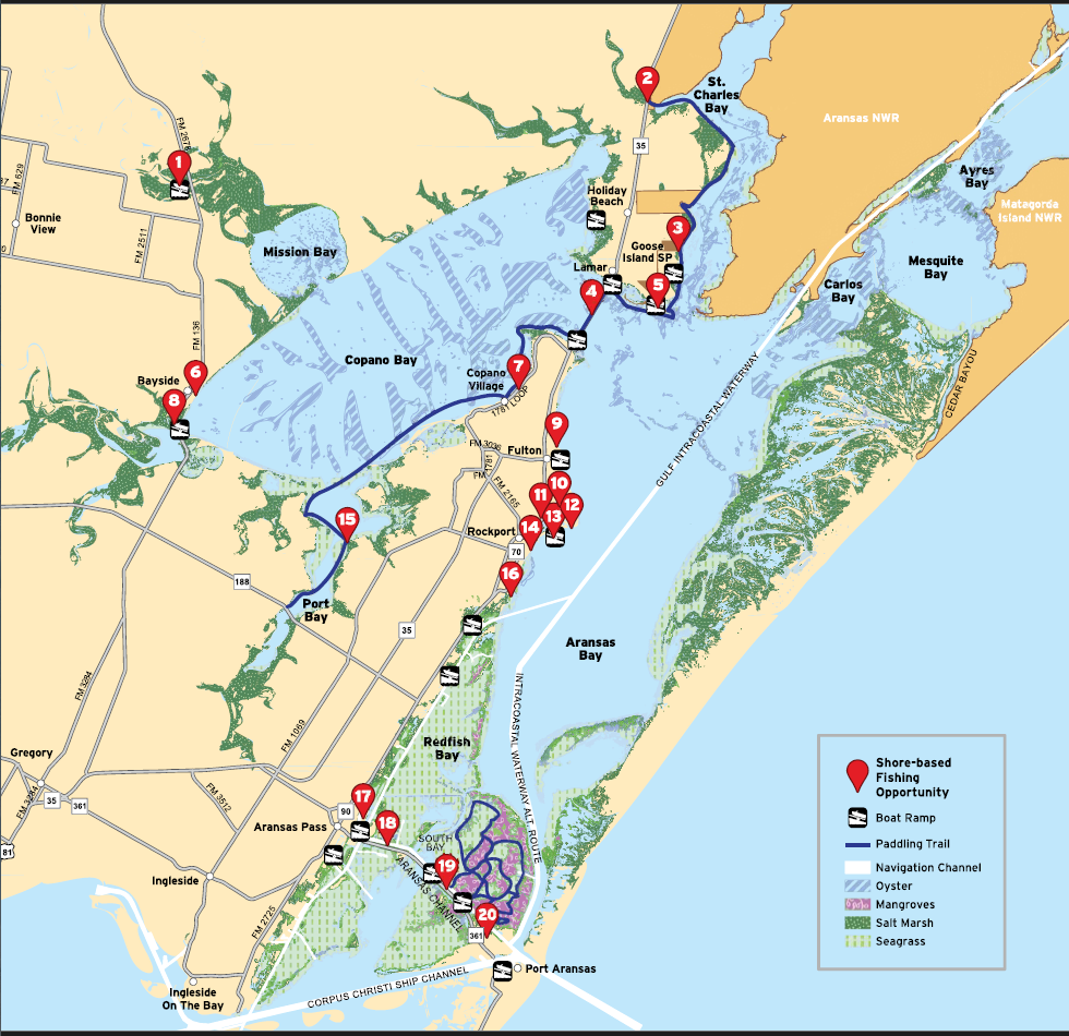
Fishing Around: Aransas
3s
Paul Daugherty NEED LINK
Description:
Locations around Aransas Bay that are locations to fish.
Purpose:
This map is included in a larger foldable brochure that suggests practical lures and types of fish to catch. The brochure will be distributed to retailers and other venues to encourage fishing.
Most Haunted Hotels in Texas
4s
Sara Brown
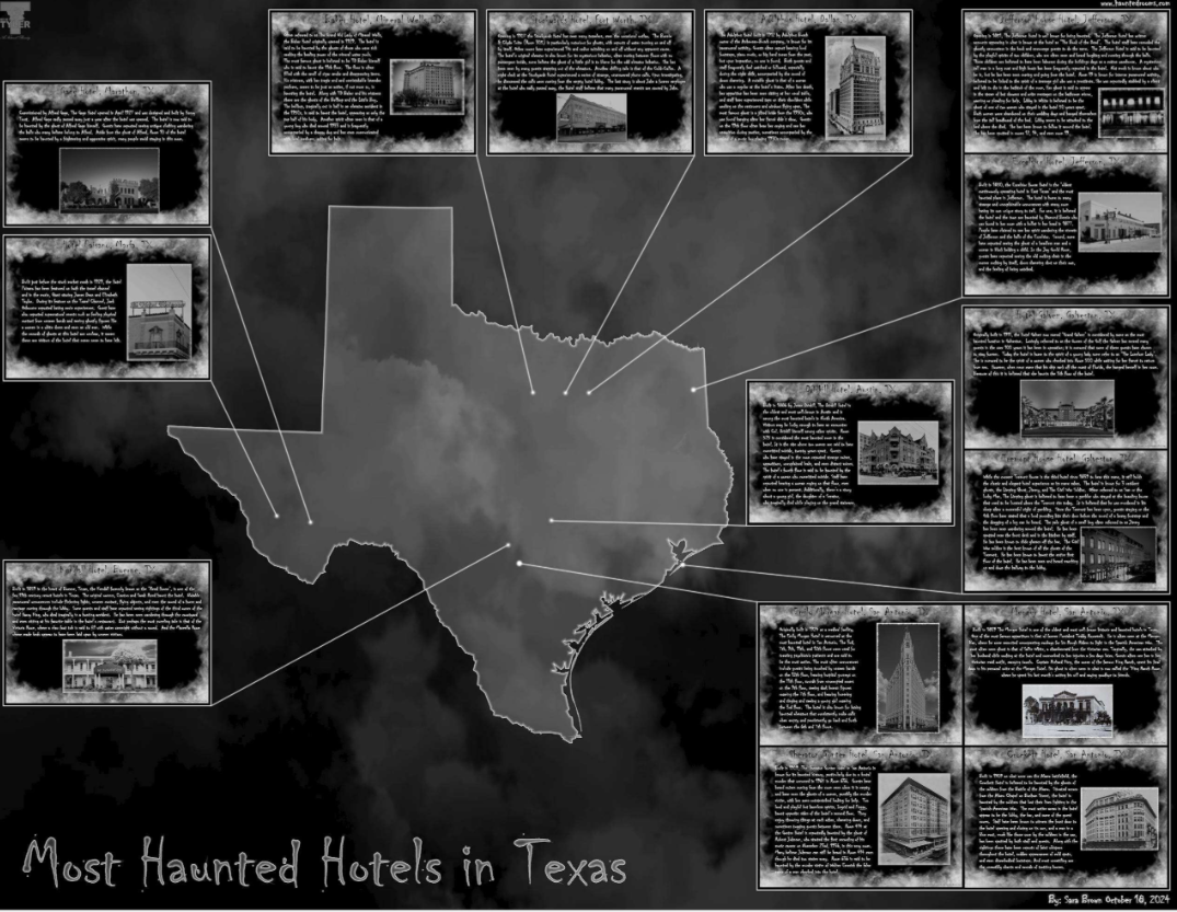
Most Haunted Hotels in Texas
4s
Sara Brown
Description:
This map tells the story of the 15 most haunted hotels and how they earned their spot on the list of the most haunted hotels in Texas while bringing attention to the various ways GIS is employed to create interesting and unique maps. The subject matter of the map and the problems it can solve; it opens up GIS to a community of people who enjoy visiting these places boosting tourism to small towns in Texas. In conclusion, this map shows what GIS is capable of and how maps are more than just navigation - they can be used to explore the world around us and tell the stories of who we are. This map was made using ArcGIS Pro and GNU Image Manipulation Program (GIMP). ArcGIS Pro was used to create the layout of the map while GIMP was used to create the text boxes and edit the photos to match the theme of the map. The skills of John Nelson inspired the symbolization of the map with much of the theme and creation techniques learned from the many of his cartography videos.The Global Glacier Casualty List (GGCL) is a dynamic platform to visualize data about recently disappeared and soon-to-disappear glaciers. We want to tell these glaciers’ stories and how their losses have or will impact human communities in terms of cultural meaning, natural beauty, water availability, economic opportunity and world heritage.
Purpose:
The subject matter of the map and the problems it can solve; it opens up GIS to a community of people who enjoy visiting these places boosting tourism to small towns in Texas. In conclusion, this map shows what GIS is capable of and how maps are more than just navigation - they can be used to explore the world around us and tell the stories of who we are.
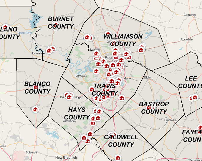
CAPCOG/Area Agency on Aging Affordable Housing Navigator
5P
Rob Buckhouse
CAPCOG/Area Agency on Aging Affordable Housing Navigator
5P
Rob Buckhouse
Description:
This map provides a snapshot of water use by category and the proportionate use by county for 2022 (most recent year available). The size of the pie charts indicates the overall volume of water usage, and the different categories of the pie chart (irrigation, livestock, manufacturing, mining, steam electric and municipal) break down how much water is being utilized in each different use category.
Purpose:
This map is hosted on the TWDB website to provide public access to data collected and analyzed by the Water Use Survey team. It offers insights into how water usage is across the state. It shows the volume of water used in each county. Additionally, the map categorizes the water usage into different types: irrigation, livestock, manufacturing, mining, steam electric and municipal. This breakdown allows for a better understanding of how water is utilized in each county.
Discover Violet Crown Trail
6s
Vanessa Alvarez Reyes
Discover Violet Crown Trail
6s
Vanessa Alvarez Reyes
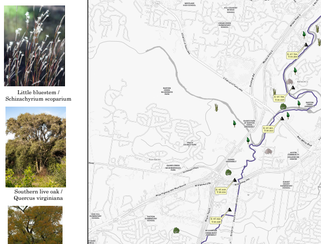
Description:
Map showing some of the flora of the Violet Crown Trail with parking locations
Purpose:
Created as request from a student for a class in Austin Community College
AI Heat Island of Central Texas
7
Staci Collins
AI Heat Island of Central Texas
7
Staci Collins
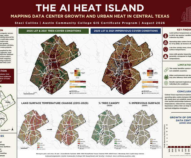
Description:
A total of 35 data center sites were compiled for the study. Using GIS and satellite-derived datasets, land surface temperature from 2013 and 2025 was analyzed alongside 2021 tree canopy and impervious surface data. a 16km2 hexagon grid and bivariate mapping were used to examine spatial relationships between data center distribution, urban heat, and land cover across the region.
Purpose:
To answer the question: How do land surface temperature, tree canopy, and impervious surface patterns relate to the spatial distribution of data centers across Central Texas?
U.S. University Competitiveness Dashboard: Acceptance Rates and Global Rankings
8S
Umme Kulsum
U.S. University Competitiveness Dashboard: Acceptance Rates and Global Rankings
8S
Umme Kulsum
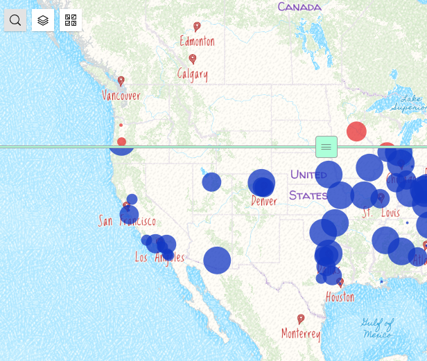
Description:
It is an interactive map that shows the QS ranking of US universities and their acceptance rate. It is part of an interactive dashboard that shows the average SAT scores as well.
Purpose:
The purpose of this product is to help students make informed decisions based on university location, global ranking, SAT scores etc.

Innovative Solutions to High-Precision
Mapping for Pipeline Integrity Management
9n
Weatherly Sawyer
Innovative Solutions to High-Precision
Mapping for Pipeline Integrity Management
9n
Weatherly Sawyer
Description:
Since 2017, AECOM has partnered with one of North America's leading energy infrastructure companies to implement their Population Density Survey (PDS) program. The construction or removal of a structure or outdoor gathering area located only a few feet inside or outside a regulatory boundary can change the classification of a pipeline segment. Any potential errors in structure classification and verified details of occupancy and frequency of usage can result in unnecessary and costly integrity projects or conversely, unanticipated regulatory and safety risks. In 2026, AECOM developed an innovative approach to enhance Proximity Surveys of identified sites of concern near existing pipeline assets. This new solution applied survey-grade Unmanned Aerial System (UAS) and subsurface pipeline mapping technology to streamline high-precision GIS mapping of pipeline corridors and structures, replacing previous methods which were built on traditional land survey techniques and CAD. The team also built tailored ESRI Field Maps data capture forms to collect pertinent attributes and photographs, customized ArcGIS Online dashboards to plan and track time-sensitive field surveys and leveraged the DroneDeploy platform to streamline mission planning and facilitate cloud-based photogrammetry.
Purpose:
This display describes AECOM's comprehensive process of ground-truthing and verifying satellite-collected building footprints and GIS-derived natural gas pipeline data via precision-centric site surveys.
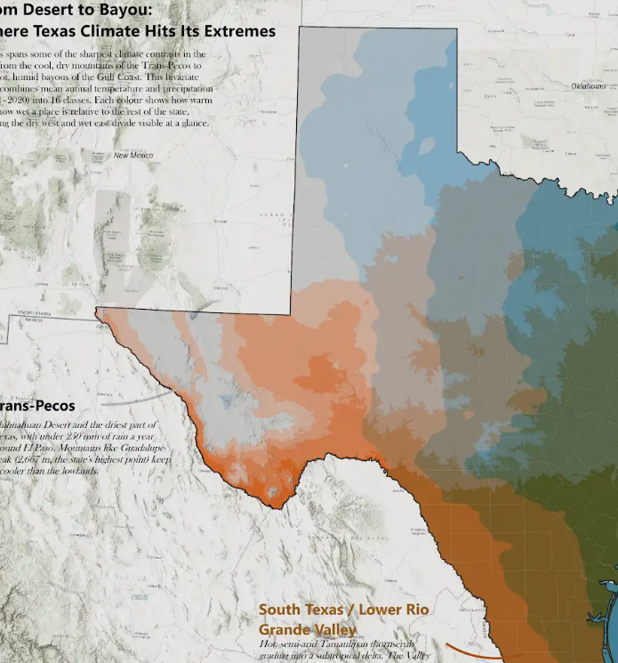
From Desert to Bayou: Where Texas Climate Hits Its Extremes
10o
Debanjan Sarkar
From Desert to Bayou: Where Texas Climate Hits Its Extremes
10o
Debanjan Sarkar
Description:
Texas spans some of the sharpest climate contrasts in the US, from the cool, dry mountains of the Trans-Pecos to the hot, humid bayous of the Gulf Coast. This bivariate map combines mean annual temperature and precipitation (1991–2020) into 16 classes. Each colour shows how warm and how wet a place is relative to the rest of the state, making the dry west and wet east divide visible at a glance.
Purpose:
Texas spans some of the sharpest climate contrasts in the US, from the cool, dry mountains of the Trans-Pecos to the hot, humid bayous of the Gulf Coast. This bivariate map combines mean annual temperature and precipitation (1991–2020) into 16 classes. Each colour shows how warm and how wet a place is relative to the rest of the state, making the dry west and wet east divide visible at a glance.
